BySage
DRAWING THE LINES BETWEEN STREETWEAR AND NATURE
BySage is a San Diego based streetwear brand designed, marketed and owned by Cameron Pitel. This is his vision.
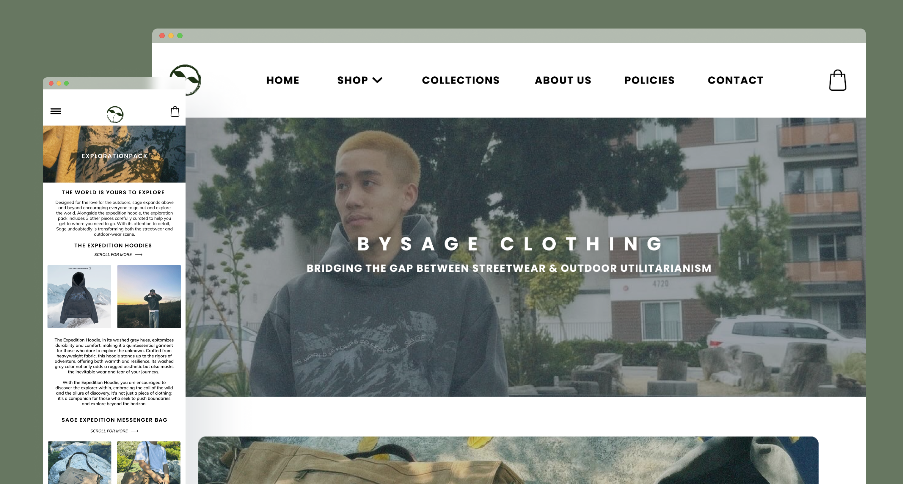
Project Overview:
Role: UX Designer
Team: Caitlyn Cielo, Ryan Eang, Donovan Le
Skills: User Interviews, User Research, UI Design, Prototyping
Timeline: January 3, 2024 – March 23, 2024
Embarking on the BySage website revitalization was a journey of merging streetwear with outdoor functionality. Working closely with Cameron, the brand’s creator, our goal was to authentically reflect BySage’s unique ethos. This project was more than just improving aesthetics; it was about weaving a narrative that showcased the brand’s commitment to quality and its community. Feedback indicated the need for easier access to previous collections, streamlining the checkout process, and bridging the gap between streetwear and outdoor utilitarianism, which in turn guided our design process. Through comprehensive research and continuous feedback, we refined our approach to ensure alignment with BySage’s identity. The outcome was a website that went beyond being a simple digital storefront to become a dynamic embodiment of BySage’s aesthetic vision.
PROBLEM:
How can we redesign BySage’s website to authentically represent its core values and aesthetic, enhancing user experience and engagement while aligning seamlessly with its urban, innovative identity?
What is BySage?
BySage, an emerging streetwear brand rooted in the vibrant cityscape of San Diego, California, is dedicated to offering high-quality, affordable fashion. With a focus on crafting collections that blend seamlessly into the everyday wardrobe, BySage sets itself apart by embracing earth tones and minimalist designs. Their commitment to providing aesthetically pleasing, everyday pieces ensures that each customer can find something that resonates with their personal style, making BySage a go-to brand for those who value reliability, affordability, and a connection to the natural world through fashion.
BySage’s Objectives
QUALITY & UNIQUENESS
The website melds fashion with nature, emphasizing unique, earthy collections
INTERACTION & USER EXPERIENCE
Engages audience with dynamic visuals and interactive elements to offer easy, intuitive navigation
AUTHENTICITY & EARTHY AESTHETICS
Captures attention with its authentic, neutral visual identity and align with fashion forward consumers
STORYTELLING & COMMUNITY FOCUS
Strives to tell unique stories through its collections and About Us to foster trust and connection
My Contributions
While my contributions included substantial research efforts, I also served as the crucial bridge between our team and our client, Cameron. This role entailed maintaining a constant stream of communication, facilitating meetings, and gathering feedback, which was pivotal for the iterative development of our project focused on Cameron’s streetwear brand, BySage.
In this project, I embraced the role of a UX designer, diving deep into the intricacies of crafting our application. Together with my teammates, we embarked on a thorough journey of user research, employing interviews, surveys, and usability tests to unearth essential insights into user preferences and challenges. This foundational work enabled us to refine our application concept to better align with actual user needs. In the design phase, my involvement was comprehensive. I actively participated in wireframing, prototyping, and the visual design of the mobile and desktop webpages of BySage. Leveraging my proficiency in UX/UI design principles, I focused on crafting intuitive navigation and visually engaging interfaces. My aim was not just to beautify the website but to enhance its functionality and user engagement, ensuring it was accessible and appealing.
USER RESEARCH
Our first survey composed of a client survey to see who Cameron is, why BySage, the overall themes revolving his brand, his goals as a company, and what his ideal website would look like. In our project with Cameron’s streetwear brand, BySage, our approach went beyond conventional design tasks. We initiated our collaboration with in-depth discussions with Cameron to understand his aspirations for BySage and what he envisioned for a revitalized website. Cameron shared his goals of blending streetwear’s aesthetic appeal with the functional merits of outdoor apparel, aiming to reflect this unique hybrid in the brand’s online presence. He emphasized the importance of a website that not only showcases the products but also communicates the brand’s core values and community-focused ethos. Our conversations delved into specifics, such as enhancing user engagement, improving navigational ease, and incorporating storytelling elements to convey the brand’s journey and vision.
Cameron Pitel
Describe the “perfect” website. What components and features does it include?
“The perfect website would be a simple, clean design in which customers could view and distinguish different products off of first glance. While still keeping it unique enough to fit the brand’s theme, I would like it to have overall easy navigation through the website.”
What are the primary goals you want to achieve with your website?
“A new and improved user-friendly interace that will increase the traffic. I want my website to display information, resources, and history. I would prefer when my site is closed waiting for the next drop, customers could input their email address to join an SMS marketing system to inform you wiuth updates directly.”
How would you describe Bysage? What aesthetic and/or vibe does it have?
“I would like to say that the business is centered around plants and the color green. The phrase “bridging the gap between streetwear and the love for the outdoors,” is a good way I would describe the brand’s aesthetic and what we are trying to accomplish.”
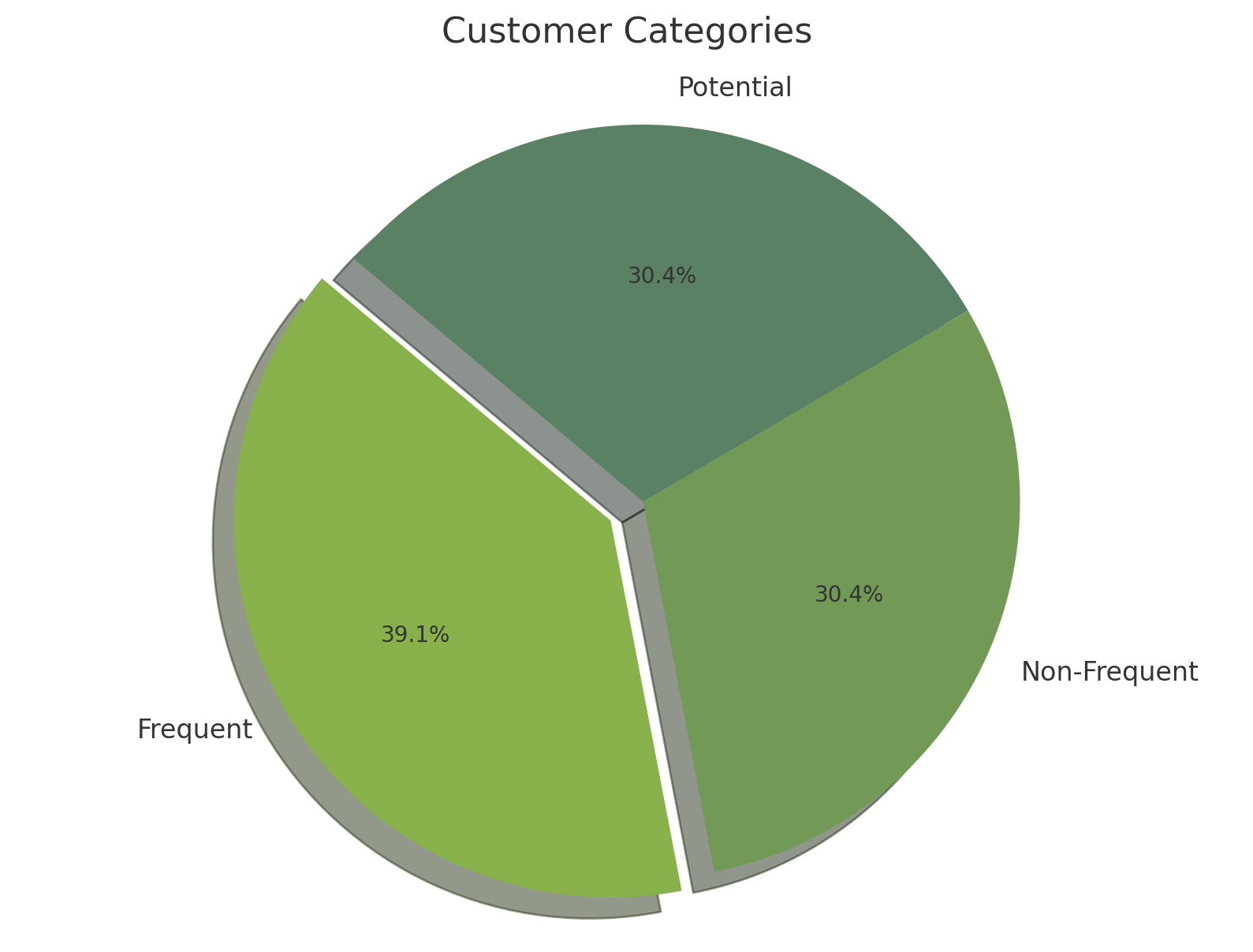
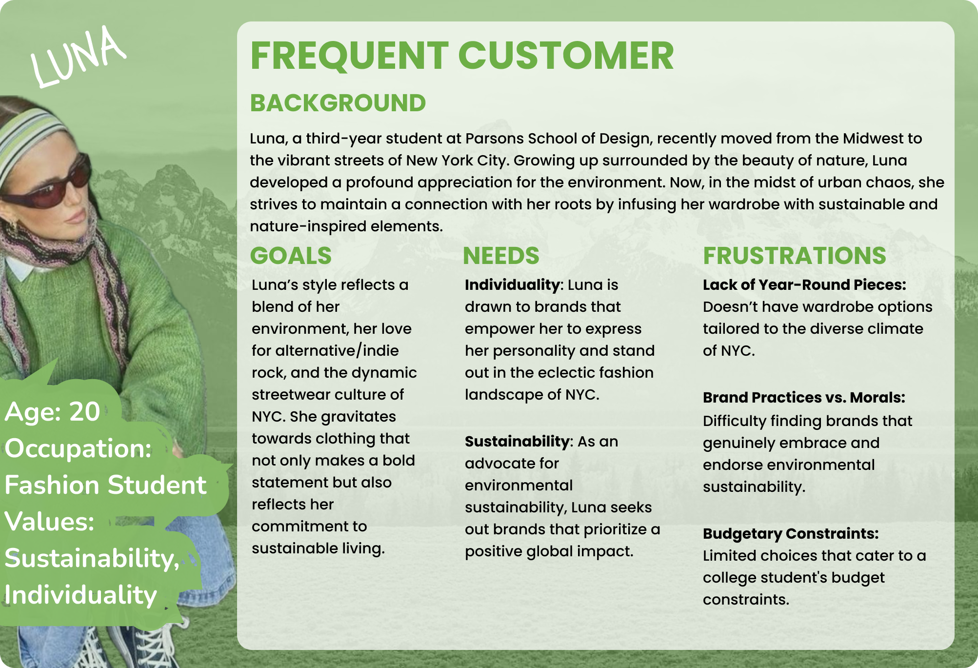
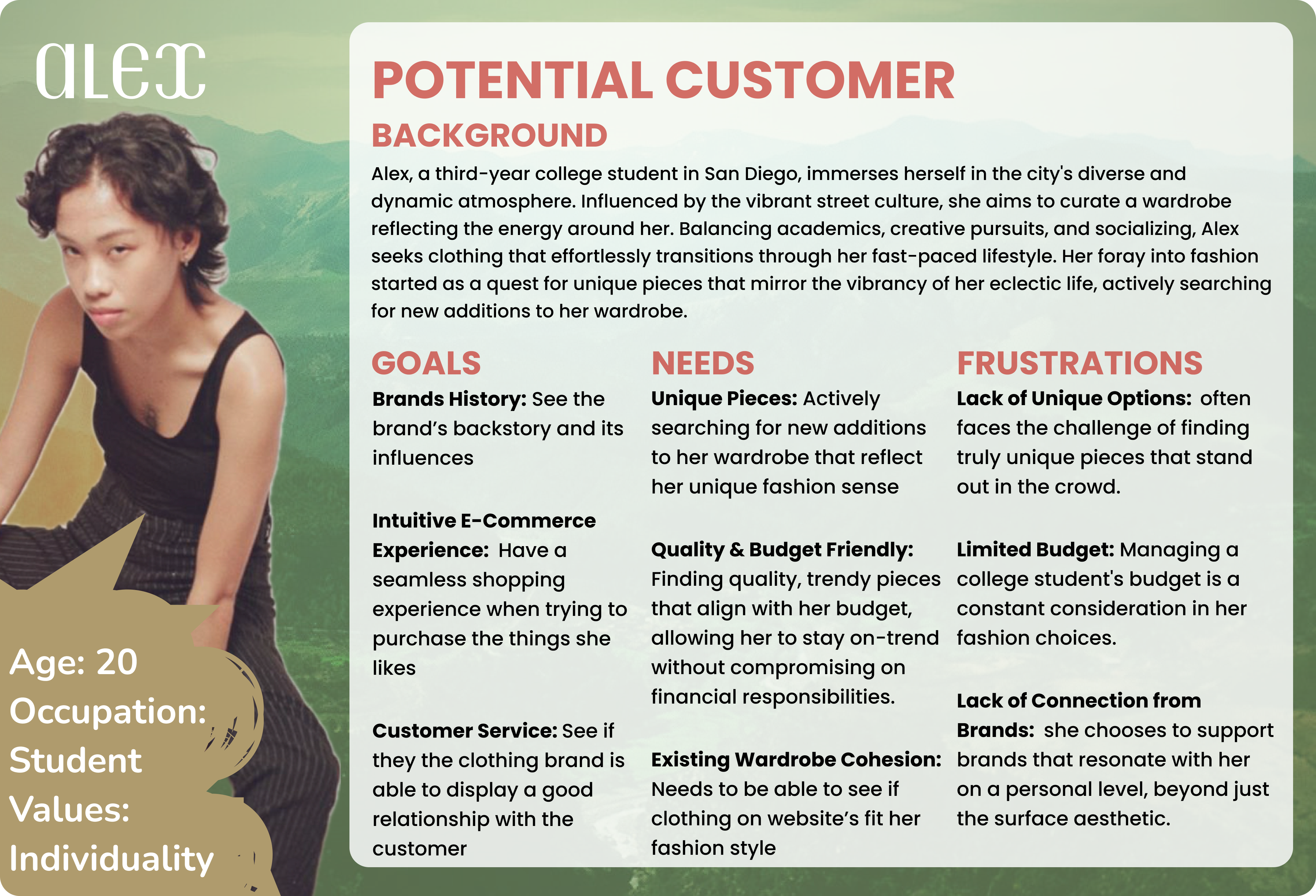
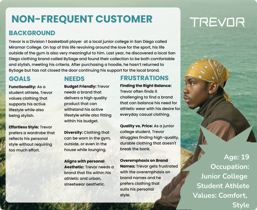
We engaged with a diverse group of 23 participants from both the UCSD community, graduate and undergraduate, and the wider public, aiming to capture insights from BySage’s target demographic. From the data collected, we gained valuable insights that shed light on the experiences of both current and prospective customers. This allowed us to identify three distinct user categories: frequent customers, who make regular purchases on the BySage platform; occasional customers, who shop less frequently; and potential customers, who have shown interest but have not yet made a purchase.
Who did we interview?
With over 39 percent of our participants being frequent customers, allowing us to fully grasp feedback from customers who are constantly on the lookout for BySage’s newest collection. These customers also provided us with the best perspectives as they are constantly using the website’s functionality.
With the other 61 percent coming from potential and non-frequent customers, we were able to review new perspectives on BySage. Gaining the knowledge from these participants, we were able to design with the intent of drawing in newer customers.
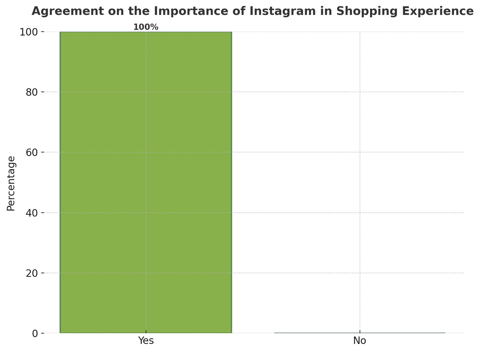
Do you follow BySage on Instagram? How important is this in your shopping experience?
One-hundred percent our frequent-customer participants noted how important Instagram is to their online shopping experience with BySage. Especially when it comes to releasing new items, most customers found the Instagram more useful than the website when looking for new collections being released.
With this new finding, we found that his website was lacking engagement and messages that would connect him to his evergrowing community.
What has been your overall impression of BySage’s online presence and customer service?
“Honestly the website is pretty plain in comparison to the instagram. You also can’t see when the page is locked for new drops which makes me forget about it sometimes”
– Undergrad, 22
“I think it’s been really good, he’s very responsive and makes sure his customers are comfortable. His timelines are really accurate in terms of when he’ll ship something out and when something will arrive.“
– Undergraduate, 20
“I really like the products and pictures they post on social media but I feel like having an email to ask questions through would be most beneficial for me because I like to make sure the product will fit”
– Student, 18
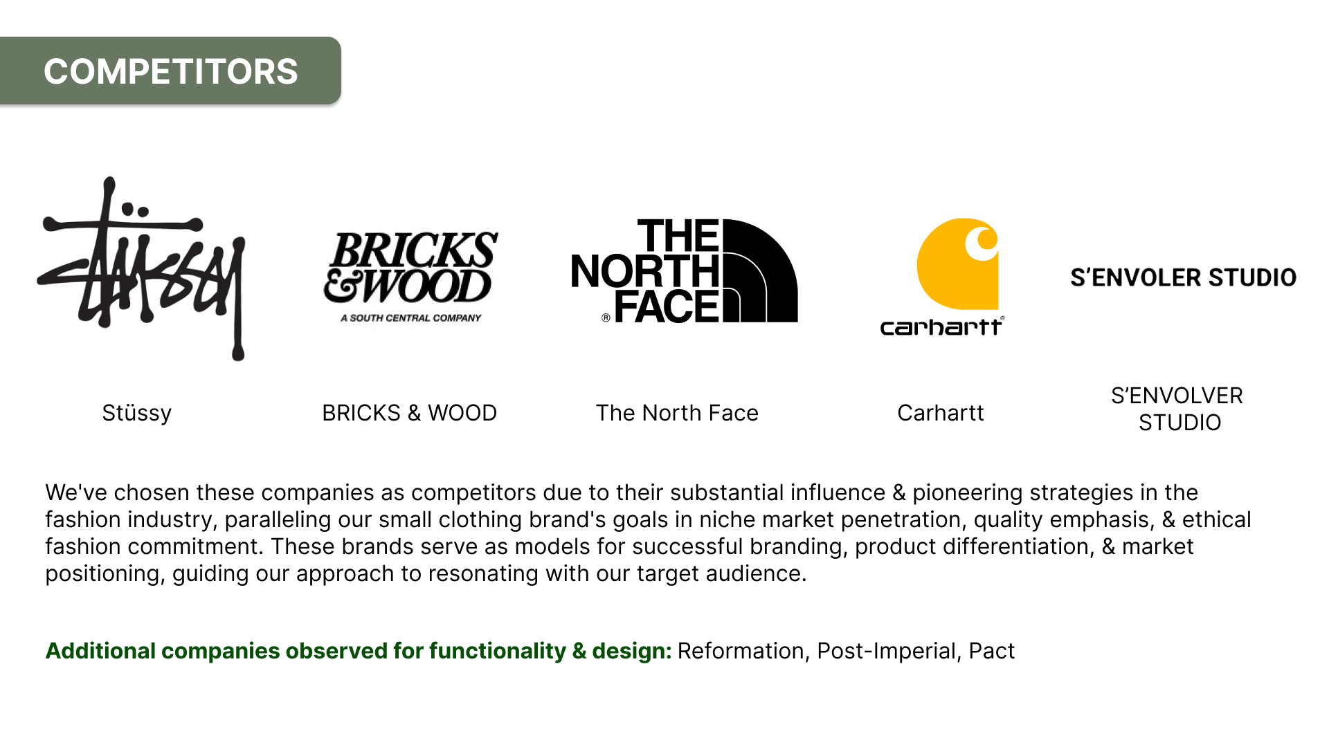
Competitive Analysis
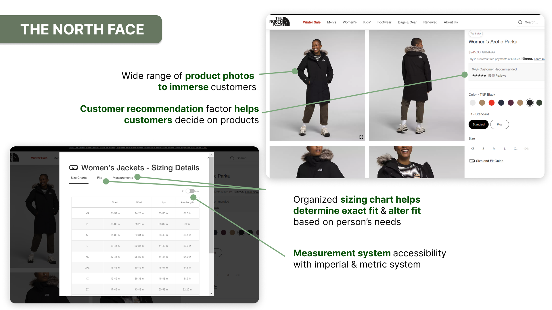
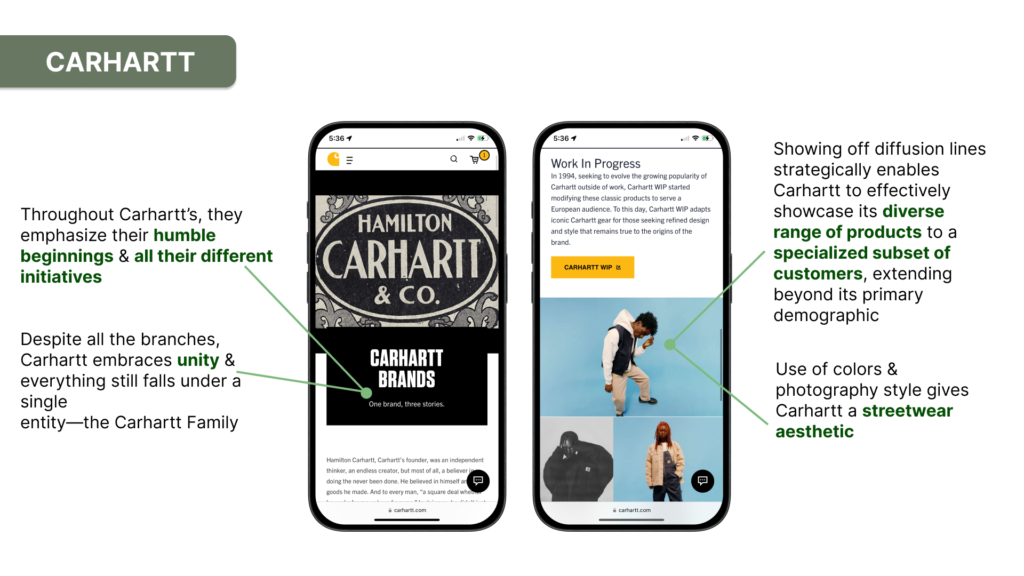
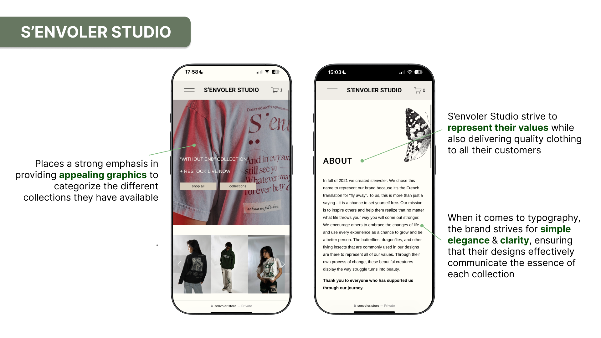
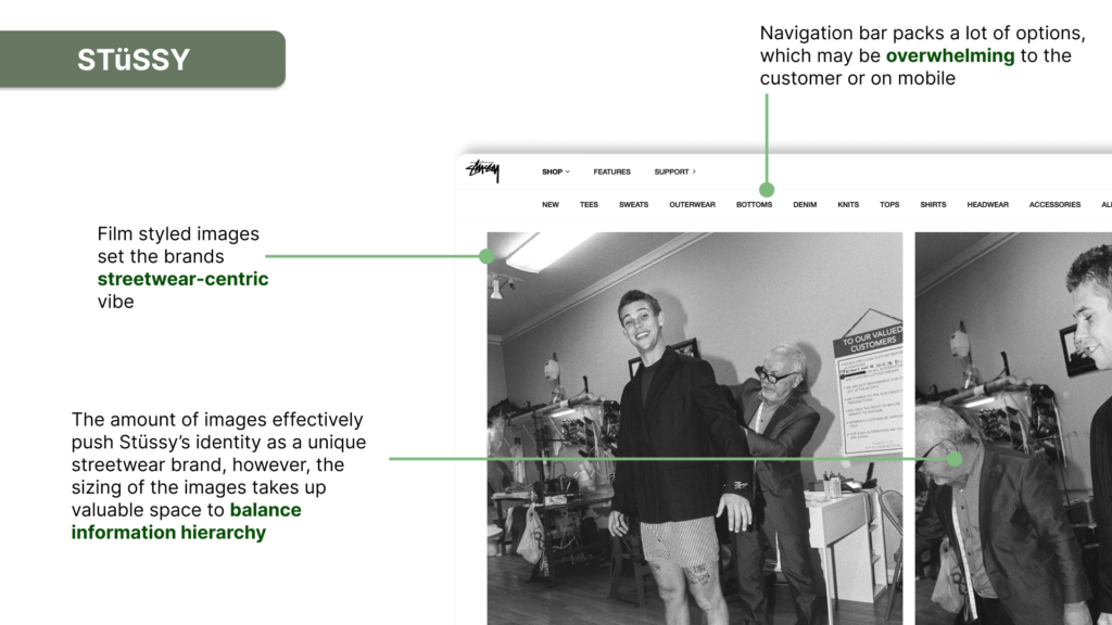
DESIGN PROCESS
Learning about BySage’s community was definitely an adventure. Starting with our mood boards, we utilized our design skills to create possible themes related to Cameron’s brand. Hearing from Cameron and his audience allowed us to really dive deep into the world of BySage, with each persona representing a customer and guiding us on our exploration to illustrate his brand’s vision.
MOODBOARDS
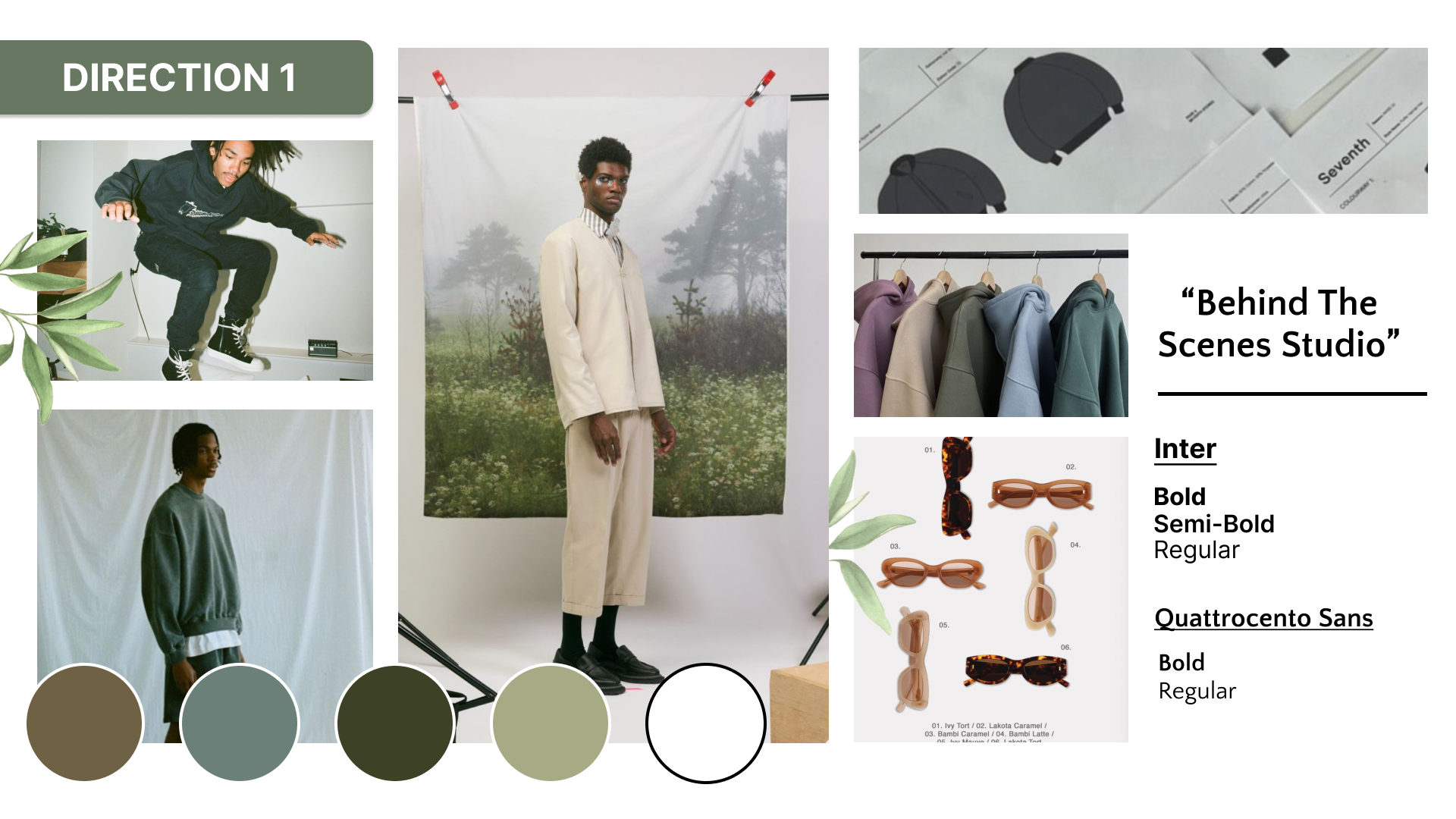
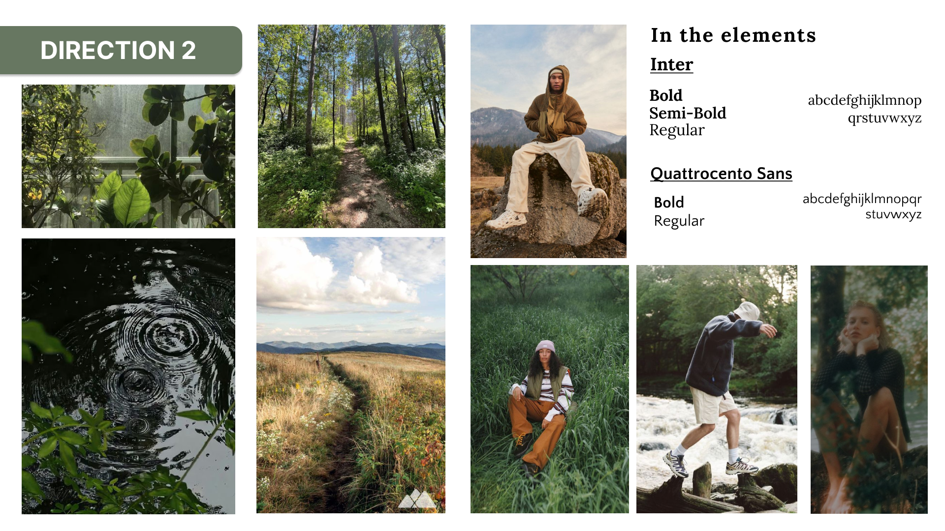
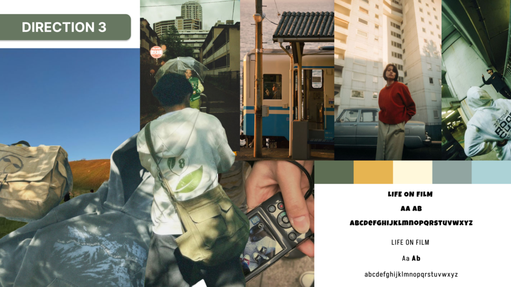
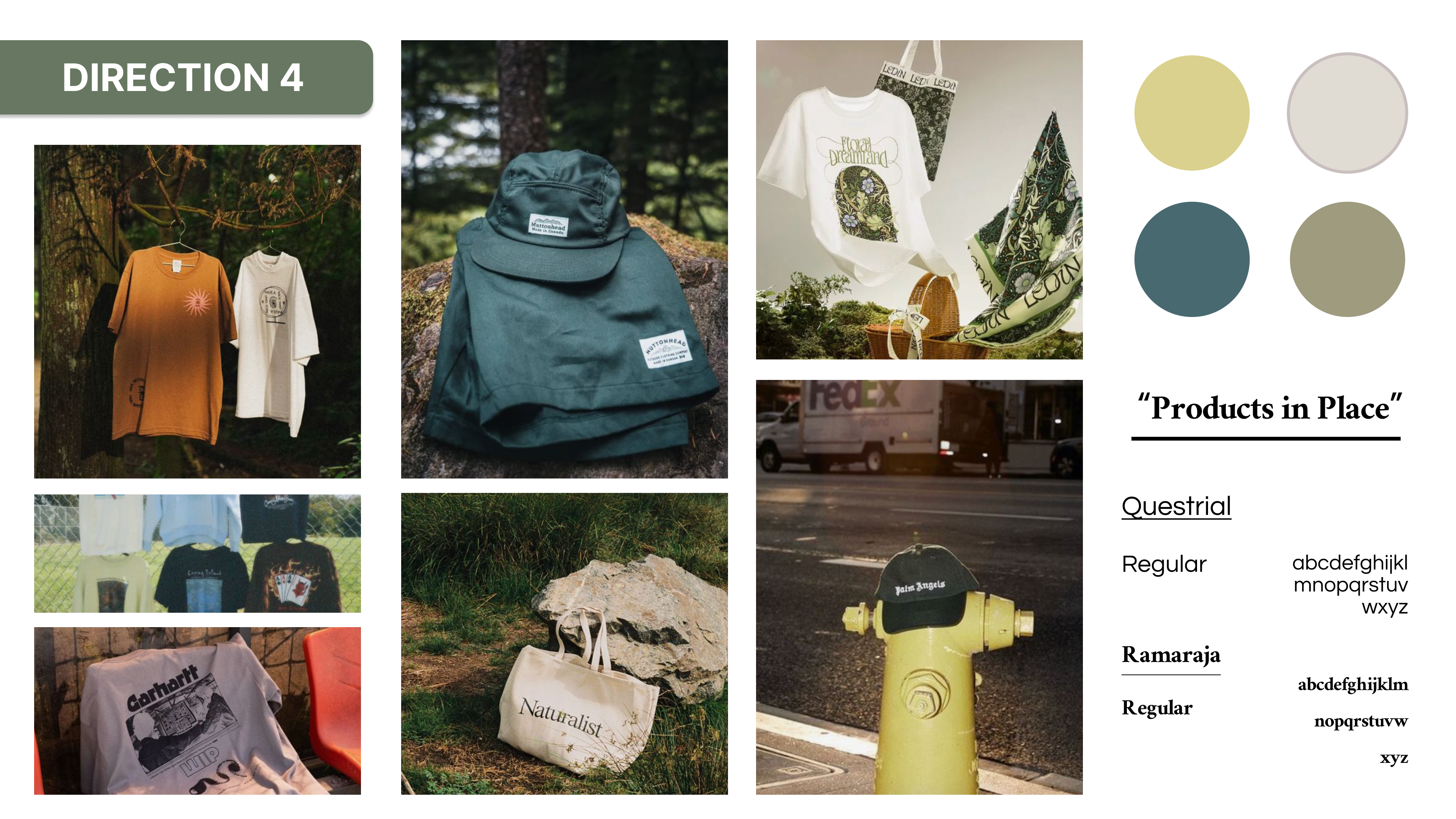
Personas
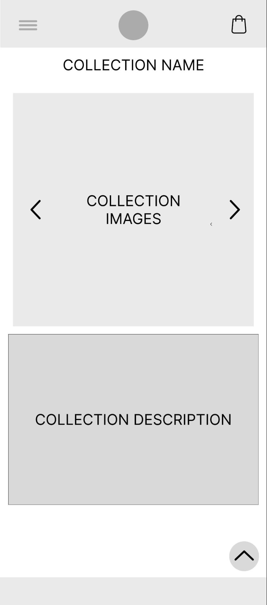
Wireframe Sketches



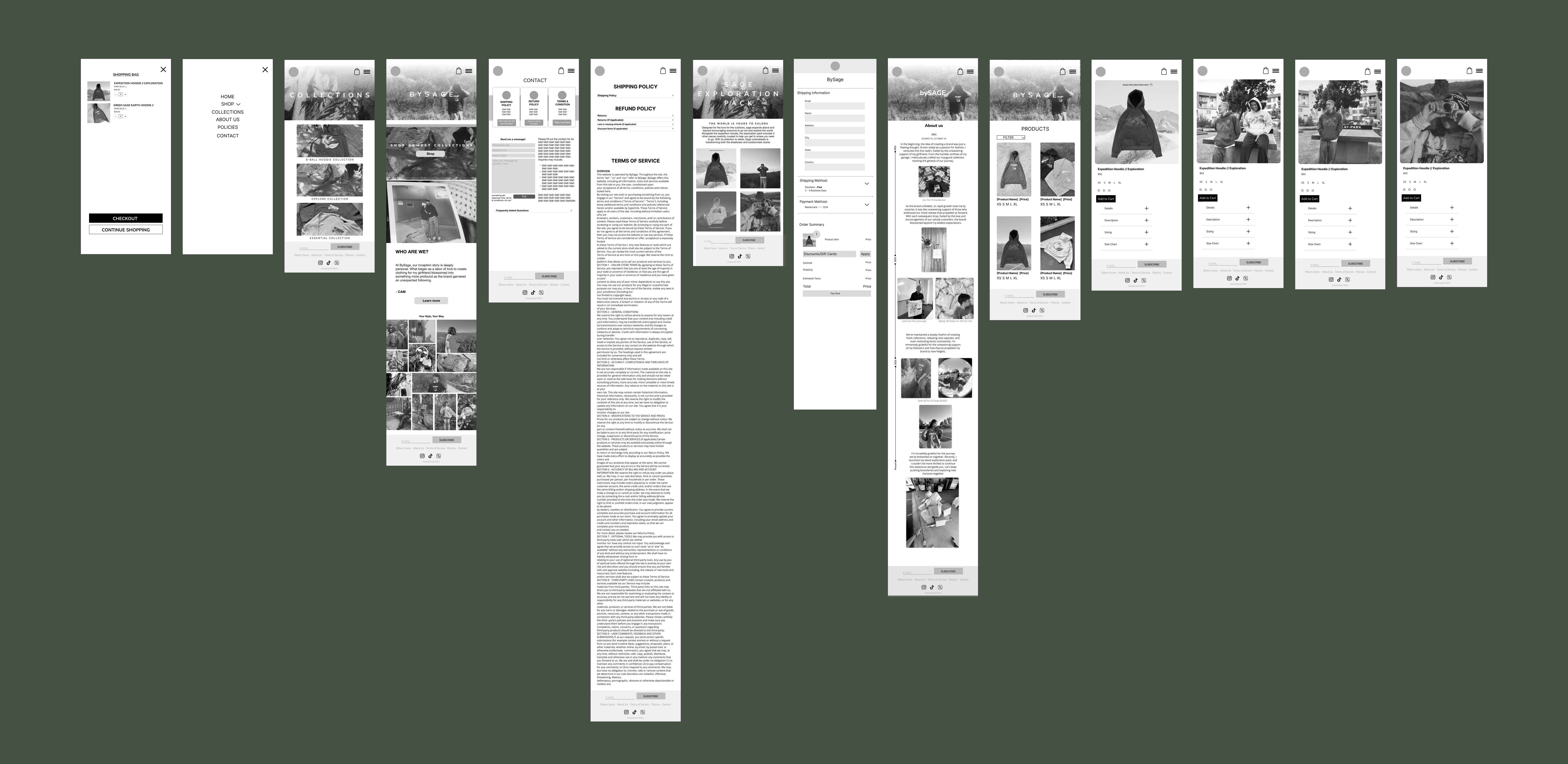
Mid-Fidelity
Desktop

Mobile
High Fidelity
Desktop

Mobile

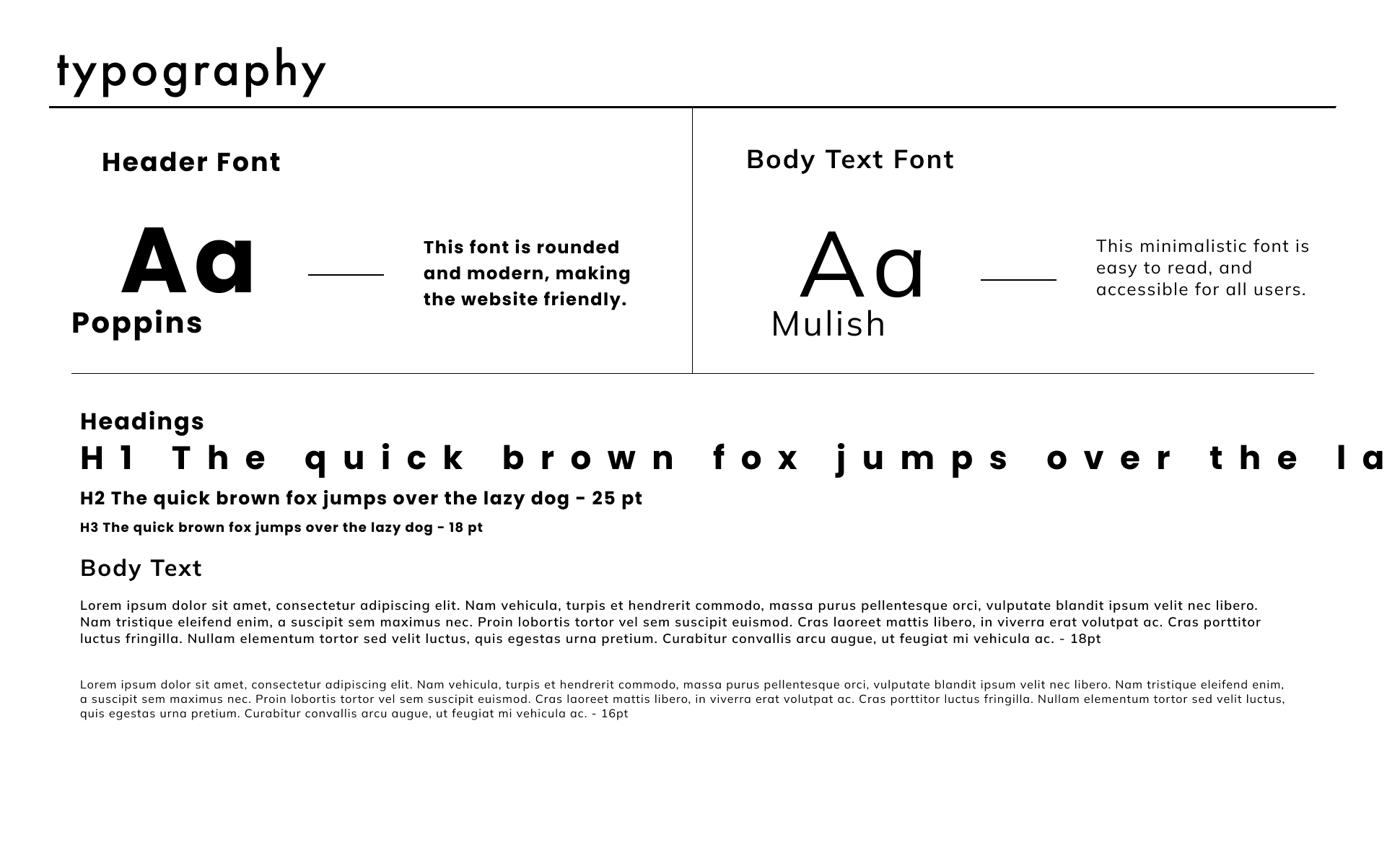
Style Guide
Usability Testing
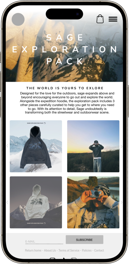
The Main Issues
- Font and text size — based on our user feedback, most found our text sizes to be inconsistent, either too big or too small.
- Little to no indicators of specific functions — our users also struggled with figuring out how to use some functions or even finding out how something works
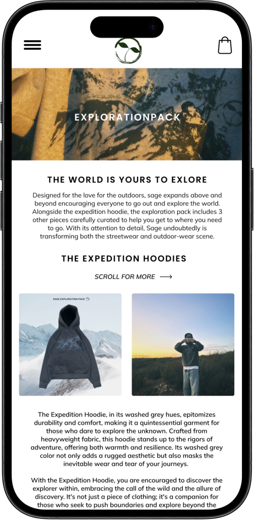
Our Response
- Changes in font text and size throughout both mobile and desktop — To combat font size inconsistencies, we utilized smaller text sizes and reformatting it for better placement
- Better call-to-action indicators — placing indicators throughout each page to improve usability
Mobile
The overall sentiment towards the mobile experience on our clothing brand site is positively inclined. Users praised the intuitive presentation and organization of information, highlighting the ease of navigation and the seamless browsing experience.
Suggestions for improvement were constructive and focused on enhancing specific features, such as more re-scaling font and text sizes, as users found some text sizes to be inconsistent with each page. Additionally, focusing on indicators for specific functions.
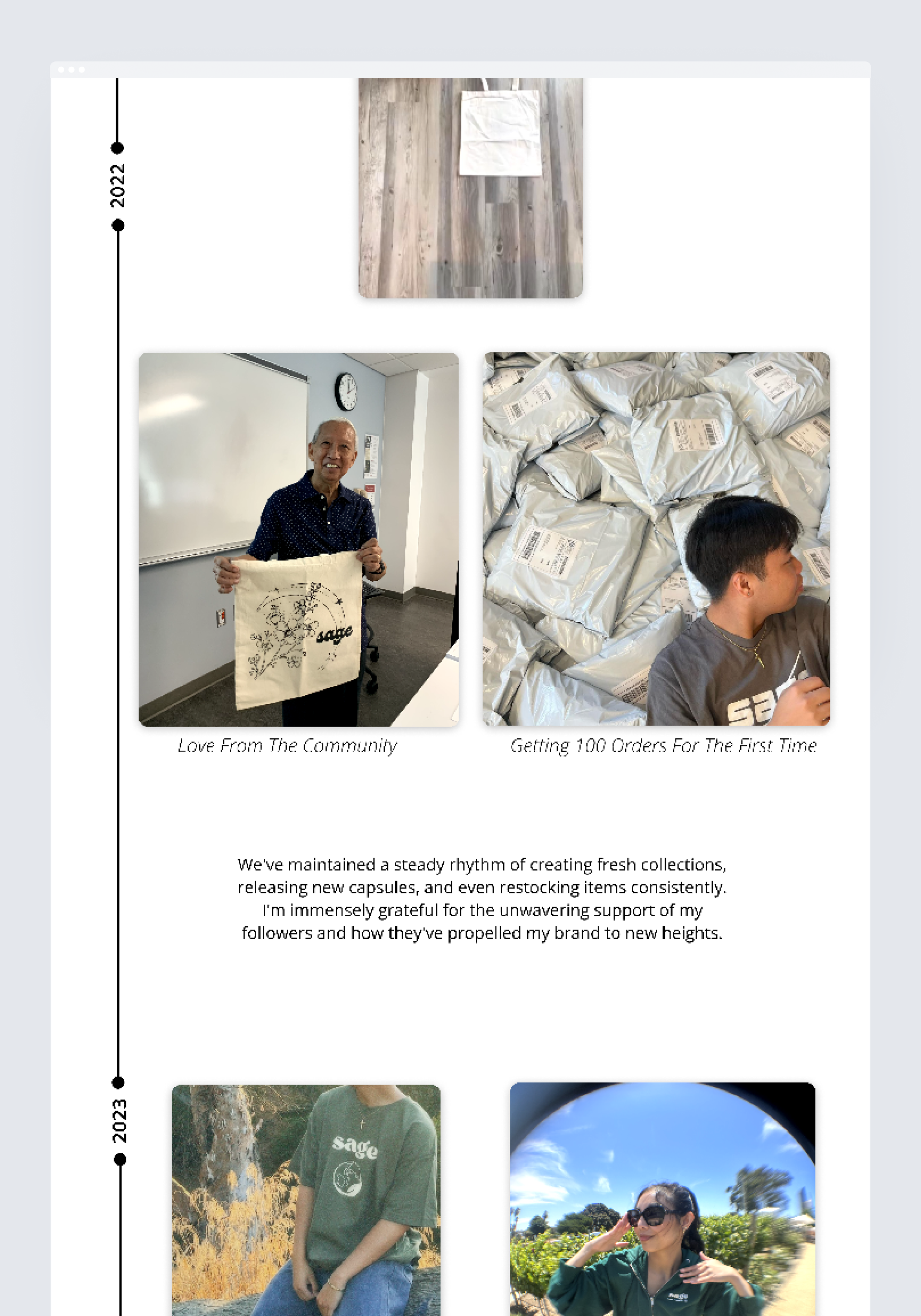
The Main Issues
- Overwhelming content size – another issue expressed by our users was most of our media and text felt unbalanced and scaled proportionally, making our users feel overwhelmed
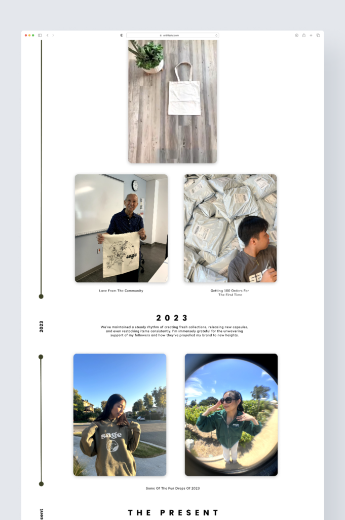
Our Solution
Rescaling website content – to make our interface feel more welcoming and less crowded, we scaled down our content to create a more balanced appearance
Desktop
Though the site was celebrated for its aesthetic appeal and user-friendly navigation, suggestions for refinement, such as enriched product descriptions and a more streamlined checkout, were noted. Performance on desktop devices received commendation for speed and smoothness, with minor calls for optimization.
Suggestions for improvement were constructive and focused on rescaling content size on desktop, prioritizing making everything feel more balanced as a user navigates through.
Solution and Functions
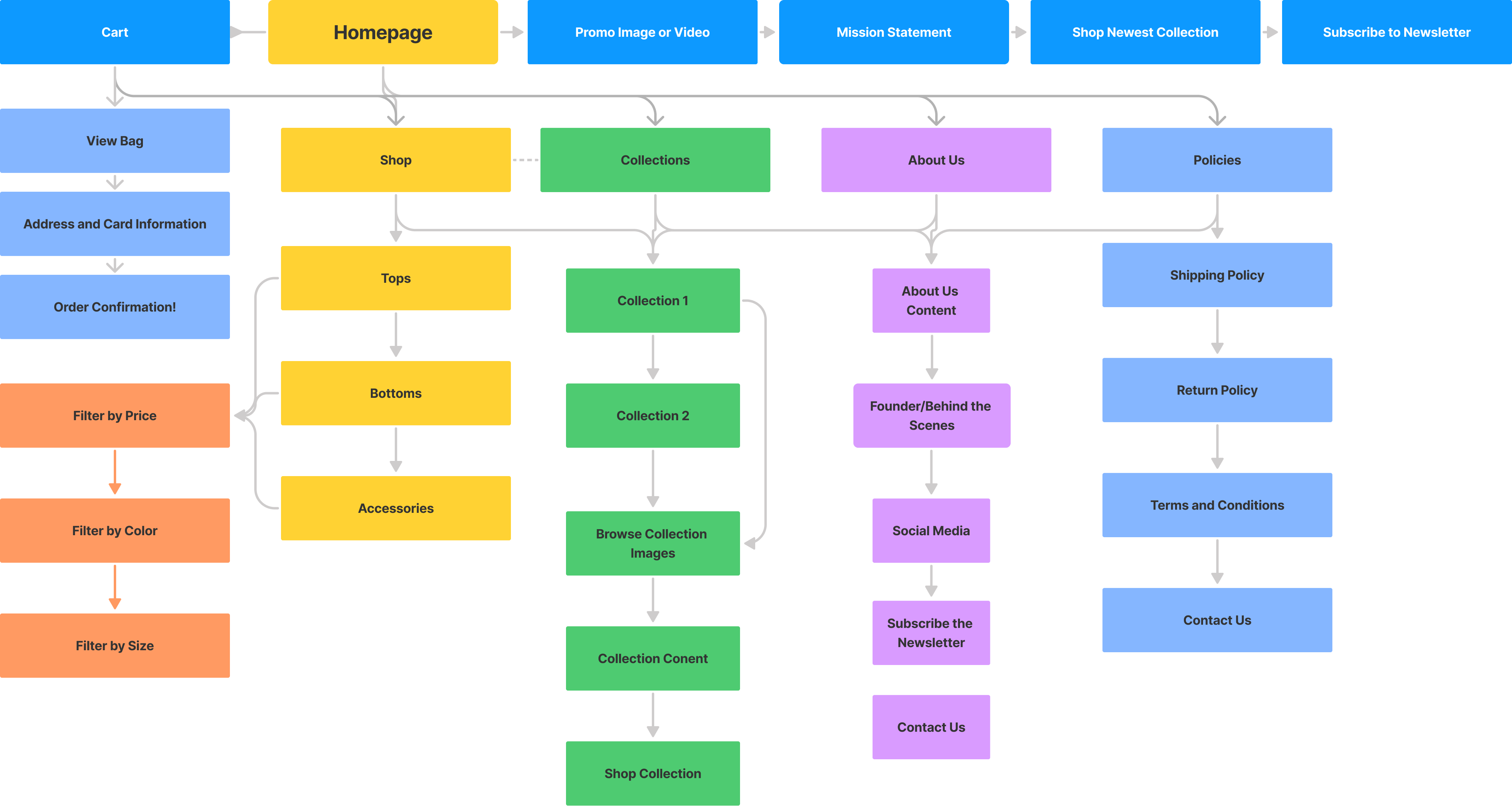
Site Architecture
Functionality
(click to play videos)
Responsive Design
To really create the immersive experience of shopping at BySage, we implemented adapting layouts and content to fit various screens. With components like the shopping bag, we are able to ensure usability across all devices.
Smooth Scrolling
We aimed for providing a seamless navigation experience for BySage’s customers. Especially for lengthy pages like this About Us page, we wanted to ensure they engaged with the content without feeling overwhelmed by the scroll function in both mobile and desktop devices.
Easy Navigation
Providing a simple but effective navigation bar was our first step to an relaxing experience. Along with this feature, we included accordions across the entire website to reduce scrolling and locating support as quickly as possible.
Hover Effects
When designing the desktop version, we wanted to give customers the ability to feel engaged with the website as they continue to browse. We provided this enhanced experience by placing hover effects for call-to-action buttons. These features not only empathize functionality but they reveal additional product details, color options, or quick view features when hovering over product images.
Accessibility features
Improving upon our low-fidelity and mid-fidelity designs, a good amount of our feedback included making the website feel more accessible. To tackle these challenges, we placed high emphasis on user-friendly indicators that take navigation to the next level. By utilizing hover effects and contrasting buttons, users are able to easily distinguish what the next step is. On top of the accordions, providing customer reviews and filters provide the user with options and create that trust within Cameron’s community.
Final Prototype
Desktop
Mobile
Review and Reflection
“The overall look and feel of the prototype is impressive. The design and detail is on point and I would definitely love to implement this! In terms of content and visuals, I think you guys nailed it.
As far as the Instagram section showcasing customers wearing my products is a great idea. Can we add a feature to elevate their visibility and engagement by adding functionality that displays each person’s Instagram handle when you hover over their image? I think this will encourage more customers to share their experiences with our products on socials. I think the site is aesthetically pleasing and I love that it’s functional, what an amazing job!”

– Cameron Pitel
BySage Owner
As I reflect on this project, I continue to be proud of all the hard work my team and I put into this project. Having known Cameron and his brand since they started back during the pandemic, to being able to collaborate and make his own vision come true is something I wouldn’t have expected as I continue to explore the world of design. From every visual piece of content to the functions behind each call-to-action, this is a website I hope to eventually implement into a functioning store where Cameron’s community can continue to grow and learn about his story.
If I was given more time to dive deeper into the functions of this website, I definitely would’ve reached out to more non-frequent or frequent customers. Something I would like to conduct is a usability testing but compare directly between someone using the current website and our new design. I think this would definitely open the room to conversations regarding what has improved, what can still be enhanced and how newer customers would feel seeing this website along with the new collections Cameron has to offer. With the team I was blessed with, I am forever grateful for how well we worked together and I hope to continue working with them as I grow in my career.
